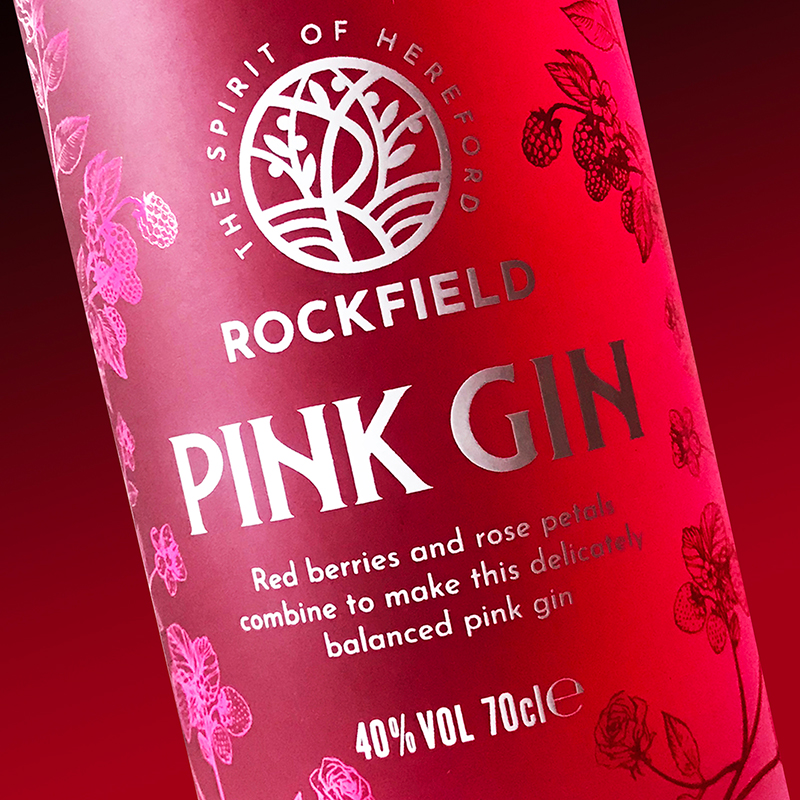
Launching a new business with bespoke branding helps establish the right impression from the very first bottle. We met the team to discuss the brief for various projects. Every business has a story to tell, and Rockfield are no different. In the heart of Hereford, the distillery based on a site that used to be Victorian cider mill. This influenced us to build their brand on these foundations to make it unique in a crowded market. Launching a new business with a bespoke brand helps to start off on the right foot.
The chosen Orchard distillery logo design, reflects the local landscape known for its rolling hills. We chose the distillery colours based on the clients' research to reflect the heritage of the site. The main colours are copper from the still and the blue from the original cider mill archived at a local museum. With our expertise, we managed to design the 'R' of Rockfield into the bespoke logo to form part of the Hereford brand.
After presenting a number of concepts to represent the new business, a logo was chosen so then we moved on to the next design stage for the core gin range.
Flexible logo & packaging
The orchard logo is flexible to print on to every item. It's positioned on a prominent place on the bottles to launch the gins and distillery. The initial project was for two flavours; dry and pink gin which we created a Victorian style pattern for the individual ingredients to be expanded as new flavours were launched. We sourced a reputable printer to screen print these designs on the bottles, using a two colour print for each flavour. To match, a capsule was designed for each flavour using branded colours to distinguish each flavour.
Brand foundation
Lastly, the brand guidelines help encompass all these elements together. To date, this Hereford brand suite has been applied to distillery signage, the website, gin bottles, event collateral and clothing.
Ultimately, having a unique brand helps you stand out, it’s all in the detail!