At
ID Creative Design, we believe that a strong brand identity is more than just a logo, it’s the foundation of trust, clarity and professionalism. Our collaboration with
Empower Accountants showcases how a how a thoughtful, professionally executed identity can reposition a business and help it connect with the right audience.
The brief
Empower’s joint founder, Paul Reid, came to us with a clear goal: to create something different from the typical accountant’s brand. Many firms rely on the similar imagery of calculators, ledgers in blues and greys, these easily blend into the background. We wanted to break away from that expectation and reflect Empower’s ethos: a modern, supportive partner helping SMEs grow at every stage.
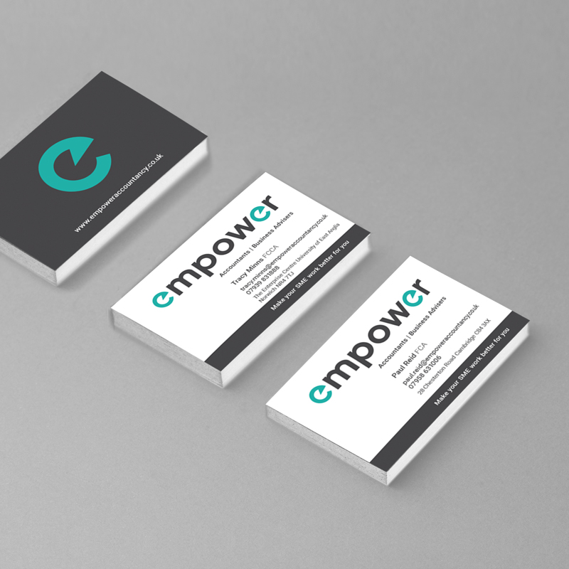
To achieve this, we developed a scalable logo suite, comprehensive brand guidelines and professional stationery, ensuring consistency and impact across every touchpoint from their launch.
To ensure Empower maintains a professional edge from day one, we designed a scaleable logo, comprehensive brand guidelines and stationery items. These items ensure the business becomes recognisable across every touchpoint, from the launch and to stand out from its competitors. By focusing on a clean, contemporary design, we avoid passing trends to provide a business with genuine longevity that remains relevant for years to come. Something the client was keen to avoid to fit into his vision.
A minimalist approach
Having worked with Paul before, we understood his appreciation for minimal, clean aesthetics. From the start, the focus was on essential elements and removing unnecessary items to display clarity and confidence. To ensure Empower maintains a professional edge from day one, we designed a scalable logo, comprehensive brand guidelines and stationery items, to complete a digital presence. Each detail was considered with longevity in mind, avoiding trends in favour of timeless form and function.
Working with a professional design process ensured every decision, from typography to colour balance, was purposeful. The inclusion of the speed dial brought movement and distinction, reflecting Empower’s bold and modern outlook.
The finished identity
The finished identity gives Empower a confident foundation within a saturated market. By moving away from standard industry visuals,
Empower now possesses a scalable identity that communicates their values while maintaining a professional high-end appearance across all digital and printed items. This visual identity ensures they are not just another face in the sector, but a modern firm with the visual credibility to back their mission to help SME businesses building a better future. By moving beyond industry clichés, Empower now stands apart with a brand that inspires trust, credibility, and ambition.
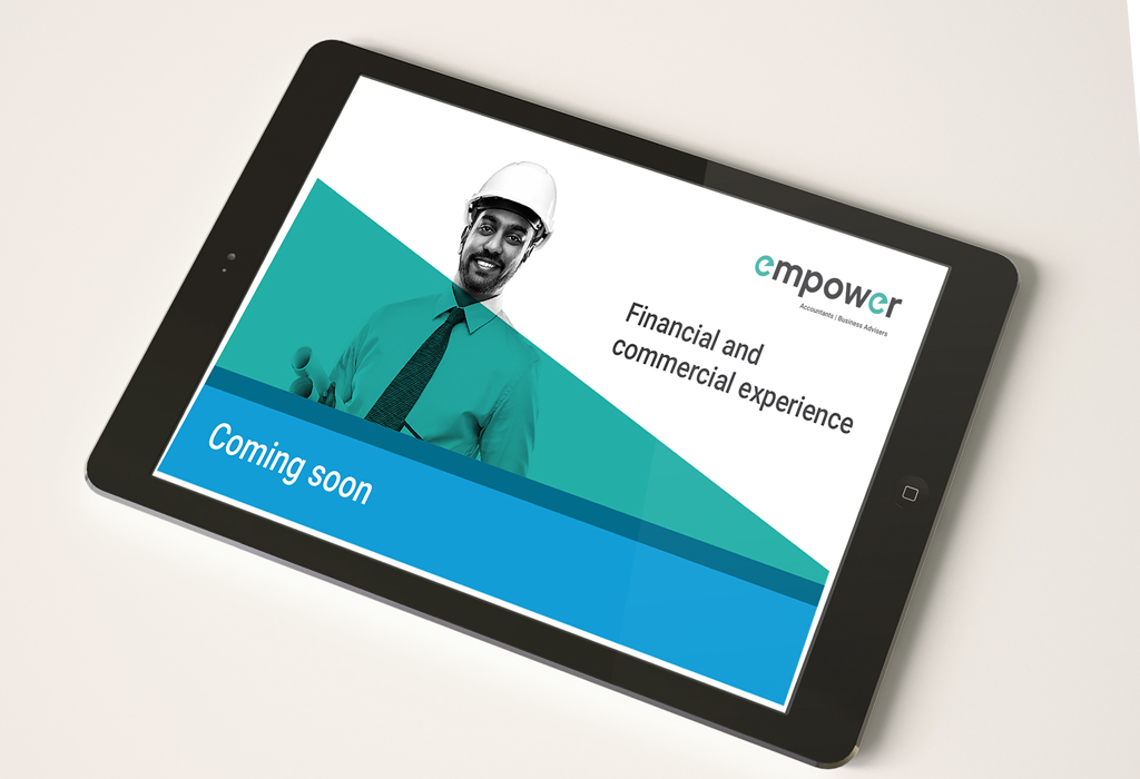
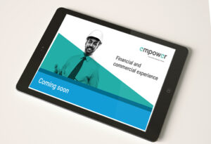
The website found here is still in development stage but we were asked to create a landing page to give people a flavour of what's to come.